Cross-Device Responsive Web Development with Web Standards

Tomomi Imura, @girlie_mac

Cross-Device Development
with Web Standards

Tomomi Imura

rwd

flickr.com/photos/64855052@N00/3967578543/ by Yoichi Nakanishib

Hello

my name is

Tomomi

@girlie_mac

One Web Approach

One Web means making, as far as is reasonable, the same information and services available to users irrespective of the device they are using.

Mobile Web Best Practices by W3C (2008)

Mobile Web Best Practices 1.0 (2008)

Form Factors · Screen Sizes

Phone/Phablet/tablet

Adaptive Design

adaptive design

Adaptive Design

  1. Progressive Enhancement
    • Enhancing Experiences based on browser capabilities
    • Graceful Degradation - Fallbacks
  2. Responsive Design
    • Fluid Layout
    • Media Queries
    • Responsive Images

Fluid Layout
Neue

fluid

flickr.com/photos/meantux/378103724/ by Denis-Carl Robidoux bn

Then

Now and Future: CSS3 Layouts

Fluid Columns

Demo on JSFiddle

CSS Multi-column Layout Module

		
.col {
    -webkit-columns: 200px; 
    -moz-columns: 200px;
    columns: 200px;
    /* column-count: auto */
}

Browser Support:

*
2.1*
3*
7*
*
10
11.5p
15Bl*

http://www.w3.org/TR/css3-multicol/

Flexbox Layout with MQ

Demo on JSFiddle

CSS Flexible Box Layout Module

#main {
	display: flex;
	flex-flow: row;
} ...
@media all and (max-width: 640px) {
	#main {
	    flex-flow: column;
	}
}

Latest syntax:

21*
7*
10*
11
12p
15Bl

http://www.w3.org/TR/css3-flexbox/

Responsive Regions Layout

Demo on Codepen: http://cdpn.io/LbAFq

CSS Regions Module

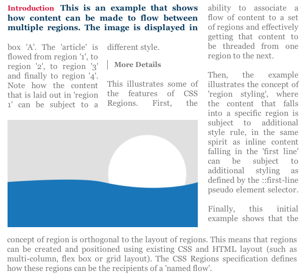
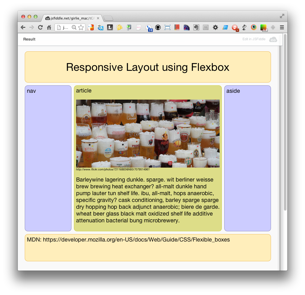
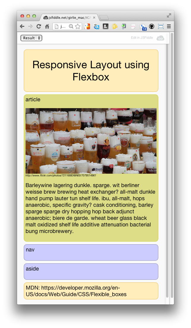
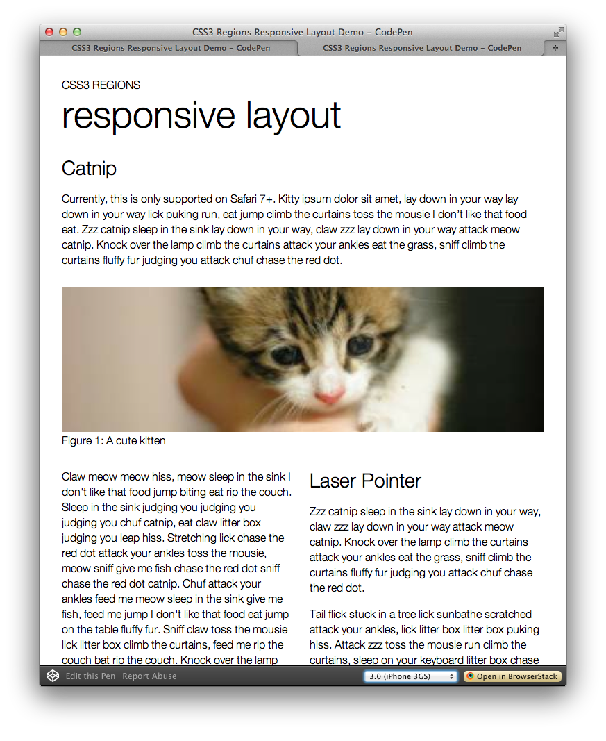
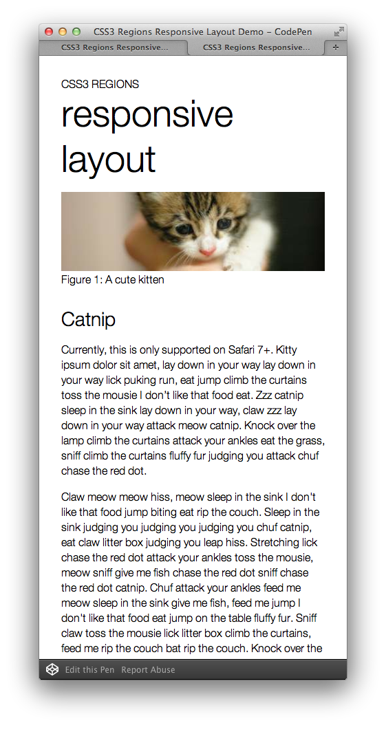
http://dev.w3.org/csswg/css-regions/

Responsive Regions Layout

<div class="region region1"></div>
<div class="region region2"></div>	...	

<article class="content">content here...</article>
		
.content {flow-into: article;}
.region {flow-from: article;}

@media screen and (max-width: 400px) {
  .content {flow-into: none;}
  .region {display: none;}
}
		
7*
10*

IE10 requires iframe

Responsive Grid

An arrangement suitable for ‘portrait’ orientation.
An arrangement suitable for ‘landscape’ orientation.
10*

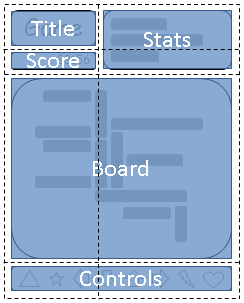
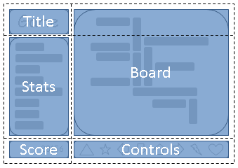
http://www.w3.org/TR/css3-grid-layout/

Media-Queries

spoons

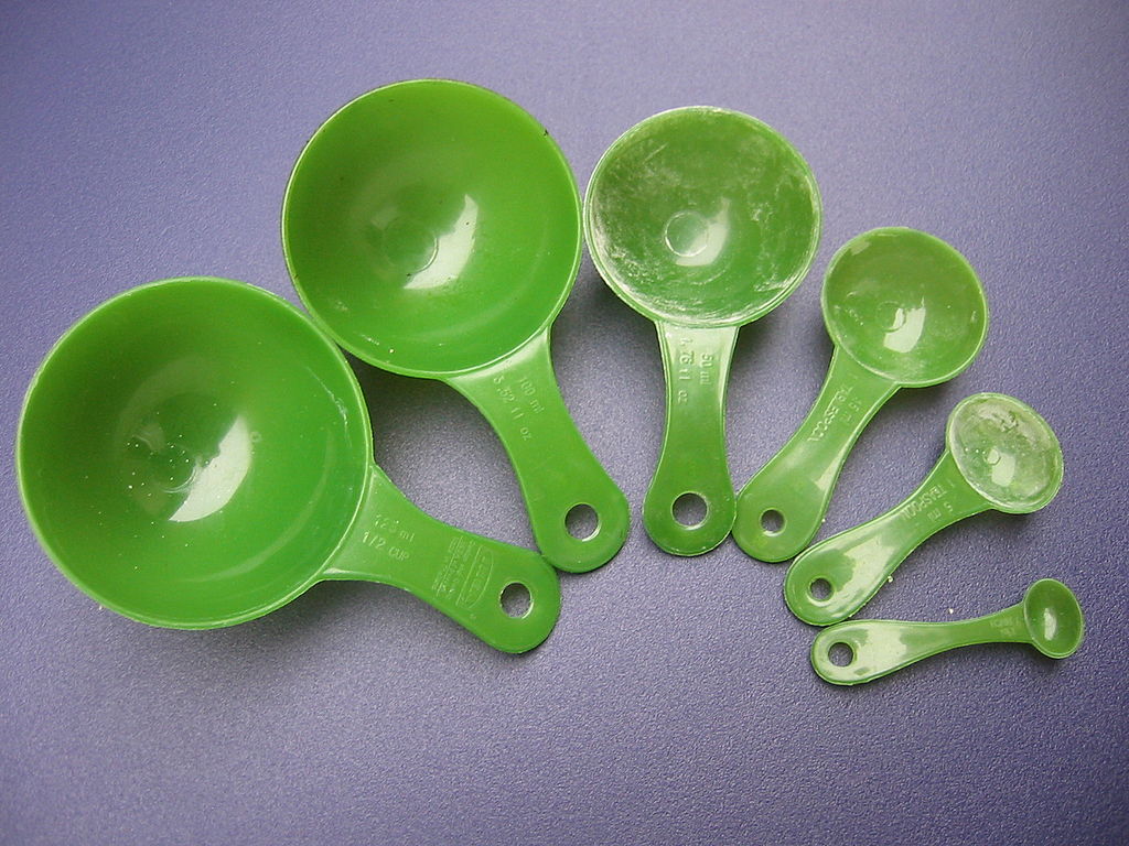
http://commons.wikimedia.org/wiki/File:Metric_Volume_Measuring_Vessels_Frontsides-In_use.jpg ba

CSS2.1 @media Media-Types

For mobile phones:

		
@media handheld {
  /* Some mobile-specific CSS here */
}

Only supported by:

CSS3: Media-Queries

allows content rendering to adapt to conditions:

etc...

CSS3: Media-Queries

Separate styles by the width of the target viewport (browser display area)


@media only screen
   and (min-width : 768px)
   and (max-width : 1024px) {
  
  /* Styles */
}

CSS3: Media-Queries

by device-width, the width of the device's screen size


@media only screen 
   and (min-device-width : 320px) 
   and (max-device-width : 480px) {
  
  /* Styles */
}
		

CSS3: Media-Queries

combined with screen orientations


@media only screen
   and (min-device-width : 768px)
   and (max-device-width : 1024px)
   and (orientation : landscape) {
  
  /* Styles */
}...
		

CSS3: Media-Queries

CSS3, Hell Yeah!


@media only screen
   and (max-width: calc(768px - 2em)) {
  /* Styles */
}...
		

CSS3: Media-Queries

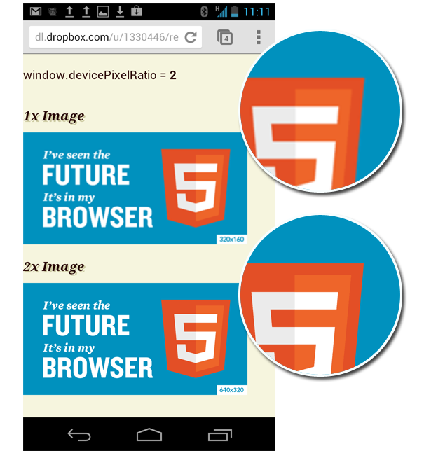
separate styles by device pixel ratio

High Pixel Density Displays

Steve Jobs

The High DPI

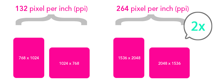
https://www.webkit.org/blog/55/high-dpi-web-sites/

The High DPI: Mobile Screens

The High DPI: Mobile Screens

The High DPI: Mobile Screens

The High DPI: Mobile Screens

The High DPI: Mobile Screens

CSS Pixel vs. Device Pixel

Pixel Density in DOM

window.devicePixelRatio
DeviceBrowserPixel Density
Nexus OneAndroid browser1.5
Galaxy NexusChrome2.0
Galaxy NexusOpera Mobile2.25
Samsung Galaxy S4Chrome3.0

Zoom Dependent Pixel Density

⌘+ and ⌘-, but not for pinch-zoom

Test page (Firefox and Chrome 31+)

Media-Queries for "Retina"


@media only screen and (min-device-pixel-ratio: 2) {
	   /* styles for hi-DPI screens */
}
		

WTF Vendor Prefix!


@media only screen and (-webkit-min-device-pixel-ratio: 1.5) {...}			
		

@media only screen and (min--moz-device-pixel-ratio: 1.5) {...}			
		

@media only screen and (-o-min-device-pixel-ratio: 3/2) {...}			
		

Unprefix: resolution MQ


@media (-webkit-min-device-pixel-ratio: 2), 
       (min-resolution: 192dpi) {
       ...
}		

Typical Browser: 96dpi (96 CSS-pixel in 1 CSS-inch)

...even easier


@media (-webkit-min-device-pixel-ratio: 2),  
       (min-resolution: 2dppx) {
...
}		
29
16

CSSOM View Module: matchMedia()

approaching media-queries in DOM


var mql = window.matchMedia(mediaQueryString);
		

Browser Support:

9
3
5
10
6
10
12.1p
15Bl

http://dev.w3.org/csswg/cssom-view/#the-mediaquerylist-interface


var mql = window.matchMedia('(orientation:landscape)');

if (mql.matches) {  
  /* the current orientation is in landscape */  
} else {
  /* portrait */ 
}		
		

CSS Device Adaptation


<meta name="viewport" content="width=device-width">	
CSS
@viewport {
  width: device-width;
}
		

CSS Device Adaptation


@-o-viewport {width: device-width}
@-ms-viewport {width: device-width} *
@viewport {width: device-width}
		
11P
10

* bug in IE10 - reports in device pixel value

@viewport in @media


@media screen and (orientation: portrait) {
  @viewport {
    width: 768px;
    height: 1024px;
  }
  /* CSS for portrait layout goes here */
}
		

Media Queries Level 4

http://dev.w3.org/csswg/mediaqueries4/#pointer

Media Queries Level 4


@media (hover) {
   .menu li:hover {
      background-color: #bada55;
   }
}
		

MQ L4: Range Features


@media (min-height: 600px) { ... }
		
@media (height >=  600px) { ... }
		

http://dev.w3.org/csswg/mediaqueries/#mq-range-context

MQ L4: Luminosity

@media (luminosity: normal) {
  body {background-color: #ddd; color: #000;}
}
@media (luminosity: dim) {
  body {background-color: #444; color: #fff;}
}
@media (luminosity: washed) {
  body {background-color: #fff; color: #333;}
}
		

http://dev.w3.org/csswg/mediaqueries4/#luminosity

DOM Ambient Light Events Demo

Video Link: https://vimeo.com/79466285 • Codepen Demo: http://cdpn.io/pvmBs

Responsive Images

photo frames

flickr.com/photos/joaomoura/2348271655/bna

Responsive Images Use Cases

  1. Resolution switching
  2. Art Direction
  3. DPR Switching (High-Res images)

Resolution switching


Art-Direction

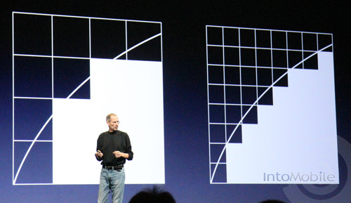
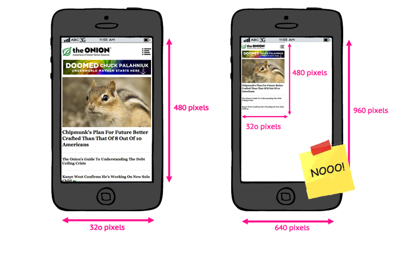
instead of simple scaling
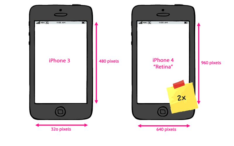
DPR Switching: High-Res Images

1x 2x

Currently used methods
and problems

Using Media-Queries


@media only screen 
  and (min-device-width : 768px) 
  and (max-device-width : 1024px) {
    background-image: url(cat-tablet.jpg);
    width: 640px; height: 320px;
}
@media only screen and (min-width : 1224px) {
	background-image: url(cat-desktop.jpg); 
	...
}
		

Yay

Meh

Fluid Resizing an Image

Fluid Resizing an Image

Shrink and Stretch without MQ


<img src="images/relatively-large-photo.jpg" alt="cat">		
		
img {
    width: 100%;
    height: auto;
}
		

Yay

Meh

Art Direction: Cropping with CSS

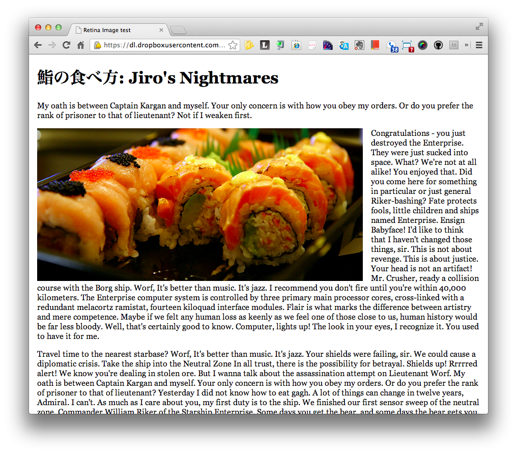
https://dl.dropboxusercontent.com/u/1330446/tests/clip.html

CSS2 Clip Property


<div class="image-container">	
  <img src="images/sushi-large.jpg"></div>		

.image-container {position: relative;}
.image-container img {position: absolute;}

@media only screen and (max-width: 480px) {
  .image-container img {
      clip: rect(80px 270px 270px 240px); // BLEH!!!
  }
}
		

CSS2 Clip Property

position: absolute;
clip: rect(top right bottom left);		
		

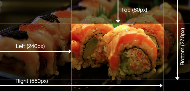
Photo: http://www.flickr.com/photos/nicolelee/1798352472/ by Nicole Leebna

Yay

Meh

Up-Res for Hi-DPI Screens

Up-Res Images with MQ


.banner {
    background-image: url(banner.png);
    width: 320px; height: 160px;
}
@media (-webkit-min-device-pixel-ratio: 2), 
       (min-resolution: 2dppx) {
  .banner {
      background-image: url(banner-2x.png);
      background-size: 100%;
  }
}
		

Yay

Meh

Up-Res with CSS image-set()

<div id="photo01"></div>	
		

#photo01 {
    width: 300px; height: 200px;
    background-image: url(images/lowres.jpg); 
    background-image: 
        -webkit-image-set(url(images/lowres.jpg) 1x,    
                          url(images/hires.jpg) 2x);
}
6*
19*
15bl*

CSS Image Values and Replaced Content Module Level 4

Yay

Meh

Vector Graphics FTW!

SVG


<img src="logo.svg" width="">
			

Web Font Icons

IcoMoon

Web Font Icons

<span data-icon="&#xe000;">fork me</span>	
		

@font-face {
	font-family: 'icons';
	src: url('fonts/icons.woff') format('woff');
}
[data-icon]::before {
	font-family: 'icons';
	content: attr(data-icon);
	font-size: 72px;
}		
		

Other Solutions

Responsive <img>?

O NOES! <img> was not made for the responsive design!

We need a standard solution.
... or a few.

The srcset attribute

Proposal by Apple & adopted by WhatWG


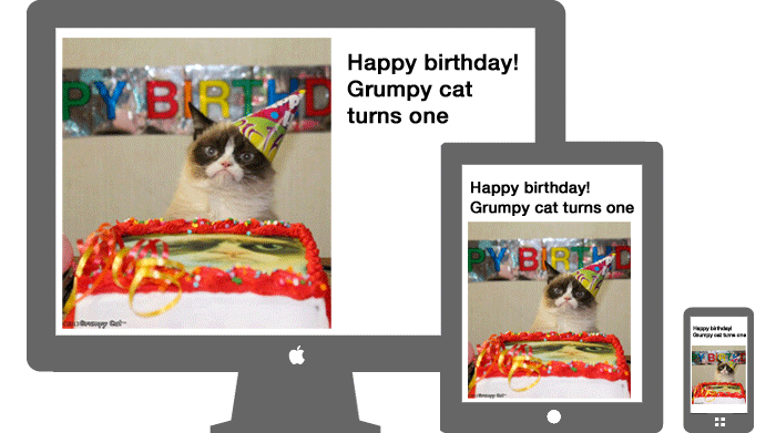
<img alt="The Breakfast Combo"
     src="banner.jpeg"
     srcset="banner-HD.jpeg 2x, 
             banner-phone.jpeg 100w, 
             banner-phone-HD.jpeg 100w 2x">
		

WebKit Nightly r154002

The srcset attribute - An HTML extension for adaptive images

Picture Element

Proposal RespImg CG


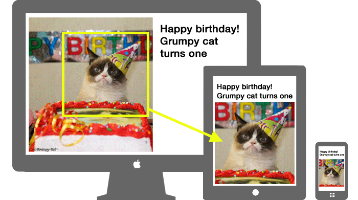
<picture width="500" height="500">
   <source media="(min-width: 45em)" src="large.jpg">
   <source media="(min-width: 18em)" src="med.jpg">
   <source src="small.jpg">
   <img src="fallback.jpg">
   <p>Accessible text</p>
</picture>
		

Responsive Images Community Group

HTTP Client-Hints

Proposal from Google: let the server selects the right asset


[Request]

GET /kitten.jpg HTTP/1.1
User-Agent: ...	
Accept: image/webp, image/jpg
CH: dpr=2.0  
		

http://www.igvita.com/2013/08/29/automating-dpr-switching-with-client-hints/

What's
Next?

HTML5

http://www.flickr.com/photos/barbostick/3581760713/ ba

Smart TV

W3C: Web and TV Interest Group

Panasonic Viera Smart TV

Automotive

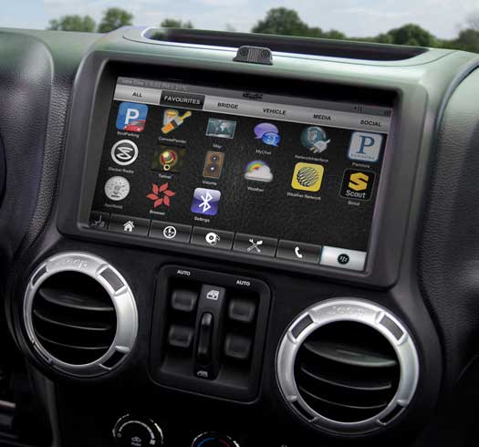
proposals for standardizing HTML5-based vehicle APIs:

W3C: Automotive and Web Platform Business Group

QNX Auto Blog

Wearable Devices & IoT

http://imgur.com/g/memes/qKH2tM8

Thank you!

Tomomi Imura

Slide: http://girliemac.github.io/presentation-slides/html5-mobile-approach/rwd.html

Fork me on Github